Building a User Success Legibility Funnel
I’ve always been frustrated by the lack of useful/meaningful real cases in Product Management (case-study). I hope this (slightly blinded) case helps demonstrate a variety of principles of options, trade-offs, surprising outcomes, etc.
Context:
- The product/app was a entry-level job market, where Hiring would be for multiple people for the same role, hired and onboarded in periodic waves, after a long (6+ month), unstandardized, illegible assessment process.
- Each Candidate would be in multiple application-funnels
- There was an online-only (paid) version of the service, with premium human advice available.
- The business is post-product-market-fit.
Stakeholder-defined problem: the head of the Advice department said: lots of Candidates make some progress toward getting hired, but at some point fall into a wait-and-see status, when they should be aggressively seeking further interaction with the Hirer. The Hirer wouldn’t “standardize” on our process, so he instead juggled an incoherent muddle of processes, and “touching base” would keep a Candidate “top of mind”, increasing her odds of selection; likewise, a f2f video call would be “stickier” than an email exchange.
In taking a fresh view at the core of our user's journey map, we realized that we had lots of specific onboarding steps toward building a profile, and lots of content about the fine points of performing later-in-funnel tasks, but those latter tasks weren't really laid out as a clear roadmap for users. (Some users were piecing it together themselves, but it looked like many were not.) We confirmed this with user interviews.
Product/design plan: create something like a checklist of ~12 tasks for each Candidate, separate for each Position funnel/relationship.
We even found an existing tool on the site for interaction-logging! It had been orphaned years before but not removed. Only a handful of users found and used it. We considered just updating/re-promoting that, but:
- it wasn't visual enough to provide a "relationship overview";
- it included a number of rather meaningless items - we wanted to focus on user actions that significantly improved their odds of success;
- it couldn't handle more complicated cases: for some interactions like "talk to hiring manager on the phone", we wanted to distinguish actual meaningful phone conversations from (a) leaving a message, (b) talking to an admin or recruiter, (c) getting through to the hiring manager but getting a 30sec brush-off.
Fancy cases like the latter pushed us toward a React implementation, which was new for many of our team.
We logged each interaction/state-change.
We also turned the logging into a Relationship Score, and designed a dashboard showing the score/recency for all the Relationships the candidate was in.
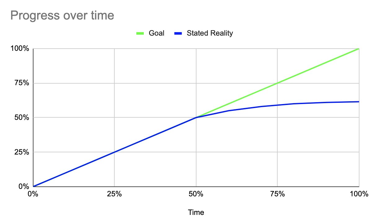
- to return to the original brief, we didn't want Candidates to stop taking action when a Relationship was at 60%.
It took roughly 6wks for the first deploy, covering the first 4 tasks. It took double that to finish. We did not A/B test results, or stage the rollout, because we didn’t have the millions of users of a consumer app to provide statistical significance. Plus the “real” outcome wouldn’t happen for months.
Findings/Outcomes
- We found high adoption of the UX, including rapid back-fill of tasks they had already done.
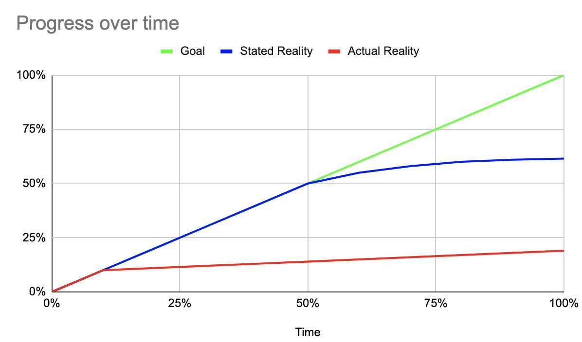
- Unfortunately, 90% of the adopters logged only the 1st couple tasks in the funnel - very few people were even reaching the state that triggered the project initiation! The premium-service Candidates were doing better than the Online-Only, but not by much. How could our understanding of customer success be so off?
- Service/support people are biased by the customers they talk to, esp the customers they speak to multiple times.
- The process/funnel was rather illegible internally as well - there was no way to quantify the progress of a Candidate, so an advisor was equally likely to over-state their success. Note this was also a problem for the Product team in doing interviews: you’d have a sense of which Candidates were more successful than others, but you wouldn’t really know how successful they were.
- Fundamentally, we believe the data (and follow-up interviews) showed that Candidates were afraid to "put themselves out there", they wanted more "preparation" time, but never stopped procrastinating - like dating-app users who fill out a profile but never respond to anyone.
- This led to me pitching our adoption of a North Star metric of "new handshakes" (or, more precisely, "% of Candidates with handshakes from 5+ hirers"), representing mutual expressions of interest from the 2 parties of a Relationship (corresponding to roughly 15% on the chart).
- Unfortunately, due to the feature-factory nature of the org, while some future initiatives focused on specific actions to nudge Candidates to take, the overall success-funnel model wasn't made a significant part of the overall UX: even the Relationship Dashboard didn't get built because we ran out of time, per the Annual Roadmap. And while we had some success in using the North Star metric to improve our idea generation, and push back on some HiPPO projects, there hasn't been the ongoing attention that builds compounding progress.
What could we have done differently (Retrospective)?
- We could have launched the Relationship Dashboard earlier, creating better overview/urgency from the Candidates (forcing execs to let us "finish").
- Bad idea: we could have stuck with the existing poor-UI logging function. I believe this would have had lower overall adoption, making our "discovery" of low success harder to "sell" up the organization.
- Bad idea: We could have killed the project after release 1. I think this was a baseline UX that was necessary for the majority of Candidates to have any chance of success, and could have been a foundation of communication for future nudges.
- We could have simplified some of the "tricky interaction" UI, delaying full clarity for a later iteration, accepting noisier data that could be refined later. (I have mixed feeling about this, as this is how you get half-assed product-debt.)
- Other ideas? Respond to the tweet!
Other takeaways:
- Getting/maintaining user adoption/retention through a long, slow-feedback process (hero's journey) is painful. Superficial gamification can work for low-investment tasks, but probably not for high-investment tasks.
- Logging detailed user actions in your own db is often very useful in exploratory data analysis.
- Combining user-log-review with interviewing is significantly more powerful than either process alone.
Edited: | Tweet this! | Search Twitter for discussion


 Made with flux.garden