Diagram Of Effects
A Systems Thinking tool. Appears in some Jerry Weinberg books. Places emphasis on finding Loops.
Each node represents a measurable quantity (not an idea, process, etc.)? Arrows between nodes show effects between quantities?
A promising qualitative modelling technique.
- the challenge I see: this is good at communicating the model in your head. But can't you end up with an infinite number of causes and effects? How do you "decide" which ones are most significant? (Society Design context) (single Root Cause/Bottleneck?)
- ah, the point is to identify FeedBack loops, either Negative Feedback that might be squashing something, or (more often) a Positive Feedback loop that's creative momentum in the "wrong" direction.
- but if causality is so bushy, then won't each FeedBack loop have the same issue?
Esther Derby article using one for modelling Organizational Change
Similar: Cause And Effect Diagram (difference as I perceive it: Fishbone Diagram focuses on a single failure event (binary) and works backwards to identify causes, whereas Diagram Of Effects may identify multiple "effects", each treated as a measurement, and specifies how a given node changes an effect node positively or negatively.)
- article on Soft Systems Methodology
- including an Ishikawa Diagram. http://www.geocities.ws/f_h_gregory/cause_eff_eff_fig3.jpg
- The greatest advantage of logico-linguistic models over the Ishikawa type is the fact that they can cover all logical possibilities.
aka Causal Loop Diagram, DiagramOfUltimateEffects, DiagramOfPossibleEffects
- Each arrow in a causal loop diagram is labeled with an "s" or an "o."... In CLDs, the arrows come together to form loops, and each loop is labeled with an "R" or a "B."... CLDs can contain many different "R" and "B" loops, all connected together with arrows. By drawing these diagrams with your work team or other colleagues, you can get a rich array of perspectives.
- Creating causal loop diagrams is not an end unto itself, but part of a process of articulating and communicating deeper insights about complex issues. It is pointless to begin creating a causal loop diagram without having selected a theme or issue that you wish to understand better. "To understand the implications of chang-ing from a technology-driven to a marketing-oriented strategy," for ex-ample, is a better theme than "to better understand our strategic planning process."
Some nice examples by John Cutler re Agile Product Development.
Does Kumu add any value vs Miro for this? (Sliding into System Dynamics.)
Edited: | Tweet this! | Search Twitter for discussion

 Made with flux.garden
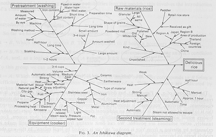